LMT BIMS is a situational awareness application developed for the Latvian National Armed Forces and other state security services. It enables real-time mission oversight, faster decision-making, and effective crisis management by connecting multiple agencies in one digital environment. The system reduces the “fog of war”, improves communication between institutions, and positions LMT as a trusted partner in defense and civil protection.
Feature overview
The Overlay feature started as a simple way to show maps with extra layers of information, but over time it grew into one of the core tools of the system. Through several redesigns, it evolved from a basic visibility toggle into a dedicated panel - and eventually into a mission-control hub that supports planning, coordination, and communication. This journey reflects how user feedback, real-world workflows, and strict procedural standards shaped the design into what it is today.
Stage 1 - basic layers
In the beginning, the map feature was designed with just one simple idea: show a base map at the bottom and allow extra information to be placed on top. These overlays could be things like mission details, tactical symbols, or shared reference points. To make this work, I added everything under the Map button - users would open a side panel and check boxes to toggle layers on or off. For a first step it was functional and straightforward, but it quickly revealed its limitations. Every time users needed to adjust their view, they had to leave what they were doing and dig back into the menus, which broke their flow and slowed down their work.
Stage 2 - dedicated overlay panel
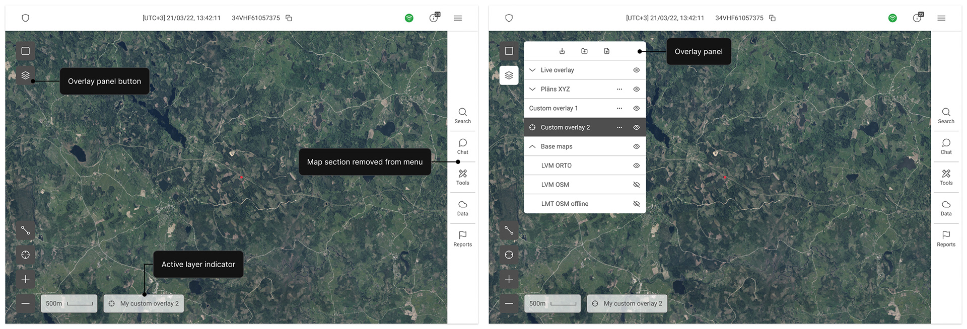
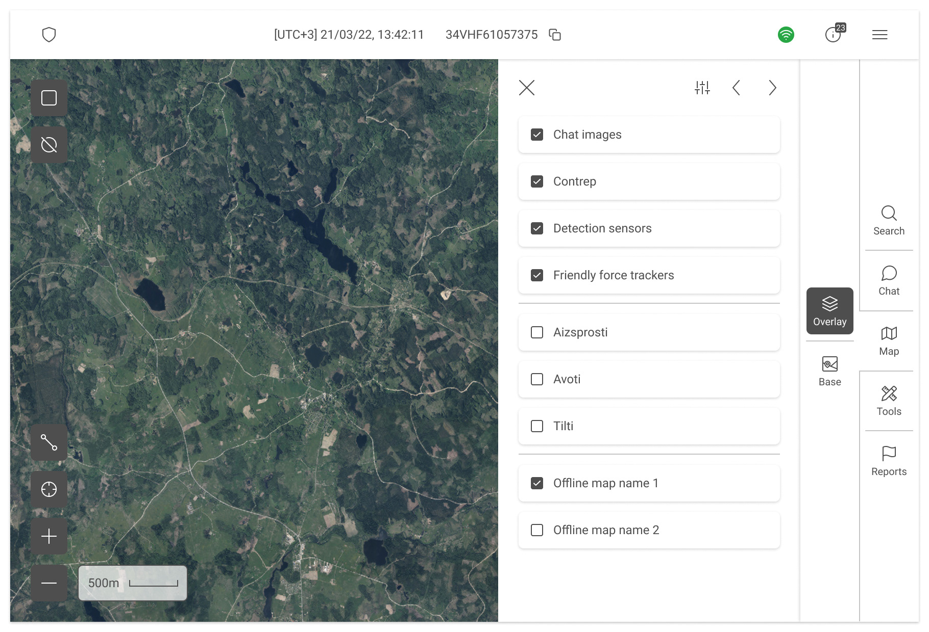
As users began spending more time in the system, their needs became more complex. They weren’t just browsing maps - they were actively working, planning, and monitoring, often switching between views while doing other tasks. Constantly jumping in and out of the different feature panels was frustrating, so the solution was to give map tools their own dedicated space. This led to the creation of the Overlay panel, a separate area that let users switch base maps, toggle overlays, and manage visibility much faster. On top of that, the panel introduced new features like creating plans, duplicating layers, and exporting data. This was the first big leap - moving from a basic visibility toggle to a tool that actually supported how users were working day to day.
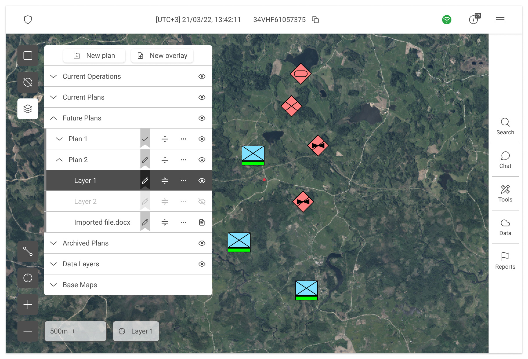
Stage 3 - from map layers to mission control
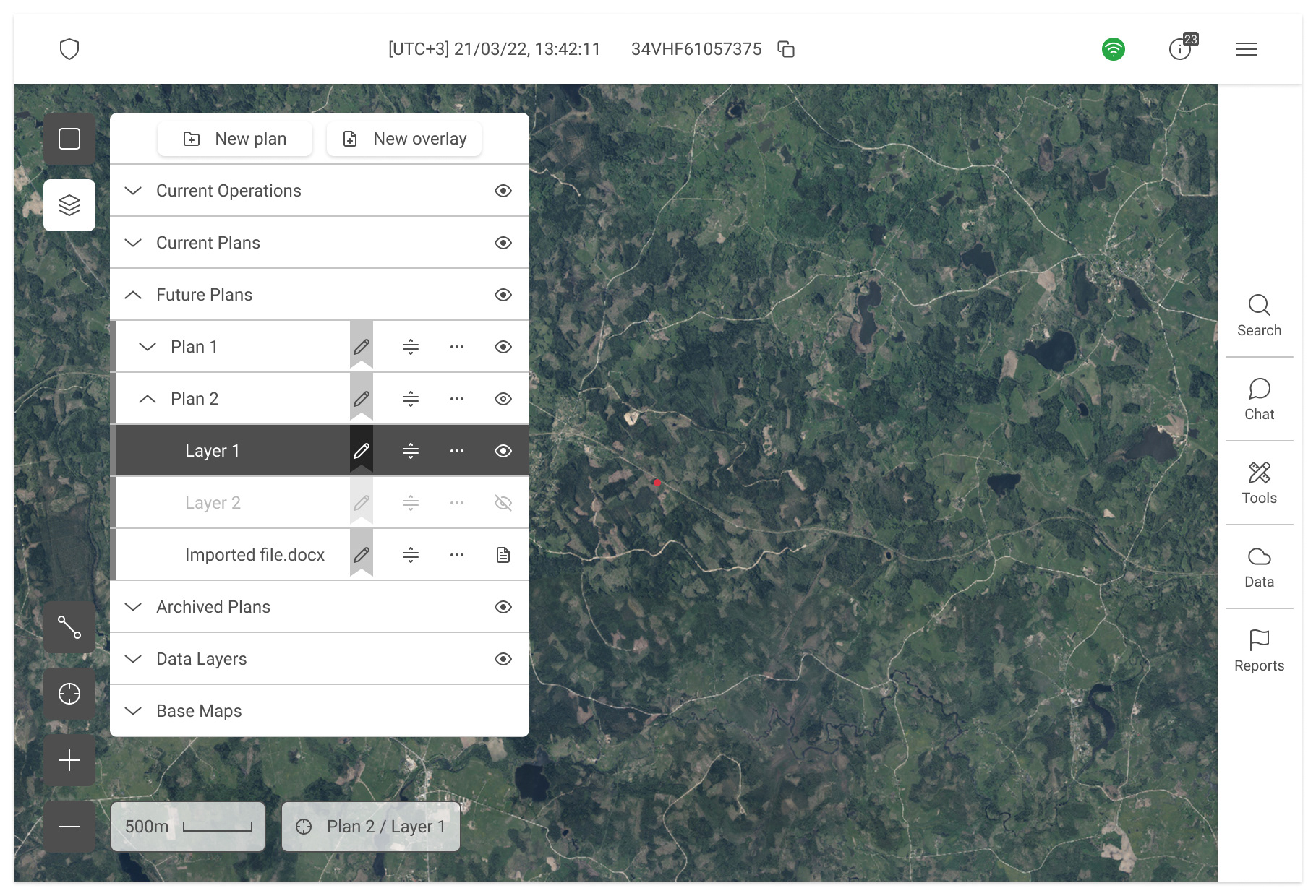
Once the Overlay panel became part of the workflow, expectations skyrocketed. Users no longer saw it as just a way to show or hide data - they wanted it to support the full process of planning, coordinating, and communicating. Military and emergency services have strict ways of giving orders and sharing updates, so the panel needed to reflect that. It evolved into a true mission-control tool: overlays could now carry status indicators, be imported and exported in multiple formats, shared across teams, and tracked as part of formal planning processes. This meant cramming a huge amount of functionality into what originally started as a simple “layer visibility” panel. It also made the tool harder to learn at first - but once users discovered the process improvements, adoption and satisfaction went up dramatically. The final design is the result of hundreds of usability sessions, continuous refinement, and the careful balancing of user expectations with official procedures and NATO standards.
Impact on metrics
Each redesign of the Overlay feature had a clear effect on how efficiently users could work with the system. Moving from menu-based toggles to a dedicated panel reduced the average time to switch map layers by more than half, cutting down the constant back-and-forth navigation.
As advanced functionality was added, such as importing, exporting, and sharing plans, we saw a sharp drop in duplicate work and miscommunication between teams. The richer toolset also increased adoption: instead of being a side feature, the Overlay panel became a core part of daily workflows, with session logs showing it was now one of the most frequently used parts of the system.
While the added complexity meant a slightly longer onboarding time, usability testing showed that once trained, users completed common map-related tasks up to 40% faster and with fewer errors compared to earlier versions.